Visual identity

Logo versions

There are different versions of the logo for different purposes and applications. The versions that should be used primarily are always the Glaston Blue positive version and the white negative version. If it is not possible to use either of these logo versions, for example due to the printing techniques used, the black logo version is to be used.

Positive
Glaston_logo_version_1
Negative
Glaston_logo_version_2

CMYK/RGB/PMS
The primary version of the logo.

Glaston_logo_version_3
Glaston_logo_version_4

Black
Black version of logo is to be used only on black and white printed material.

Logo usage

The adjacent examples show the use of the logo. The original files of the logo must always be used, and they must not be changed in any way. Always ensure good legibility when using the logo.

Logo_usage_1

Logo on a light image.

Logo_usage_2

Negative logo on an image.

Logo_usage_1

The logo must not be used over a too dark tone.

Logo_usage_2

The logo must not be used over a strong pattern.

Logo_usage_3

The dimensions or the design of the logo must not be changed.

Logo_usage_4

The colours of the logo must not be changed.

Logo with tagline

The logotype with tagline “seeing it though” is used in more formal group level communication, such as stationary, folders and company presentations, where no other logos or other statements are visible. In these cases there usually are no other brand or product messages present either, as the logo contains a message in itself. Please use a digital file for the logo and tagline combination. Do not attempt to recreate this combination yourself. Always ensure enough space around the logo.

Logo versions and usage

The versions and use is based on the same principles as the logo, see Logo usage.


Key style element

Additional style elements are graphics that – in addition to the logo, typography and color palette – create the recognizable Glaston look and communicate the brand’s personality. These, together with the Glaston style images, create the differentiating look and feel.

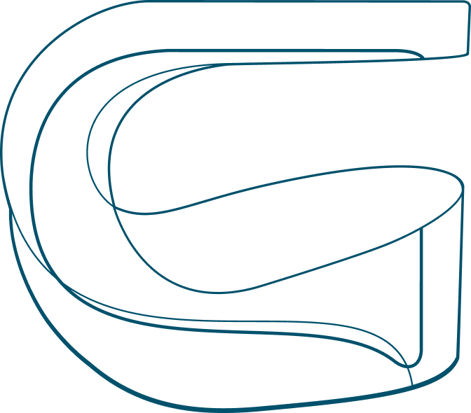
The Glaston G symbol should only be used as a decorative graphic element. It is not used as a logo together with the Glaston logotype, byt rather serves as a supporting visual element in different applications.

Key_style_element
Key_style_element_usage_1

G-symbol can be cropped. Do not divide the symbol into two separate pieces. Never tilt or rotate the G-symbol.

Key_style_element_usage_2

It can be white when used on a colored background or on top of an image.

Colours

Primary colour palette

Glaston Blue is the most dominant colour in all Glaston visuals. Additionally, Orange, Light Blue and Grey can be used to support visual expression in different applications. Avoid using lighter tones of these colours.

Glaston Blue

CMYK: 100C 60K
Newspaper: 100C 45K
RGB: 0R 81G 108B
HEX: #00516c
PMS: 3025
RAL: 5009

Glaston Orange

CMYK: 75M 93Y
Newspaper: 75M 93Y
RGB: 234R 89G 31B
HEX: #ea591f
PMS: 1655
RAL: 2008

Glaston Light Blue

CMYK: 13C 5Y 13K
Newspaper: 13C 5Y 13K
RGB: 207R 220G 222B
HEX: #cfdcde
PMS: 5455
RAL: 7035

Glaston Grey

CMYK: 33C 10M 50K
Newspaper: 33C 10M 40K
RGB: 109R 126G 143B
HEX: #6d7e8f
PMS: 7544
RAL: 7000

Typography

Primary typography

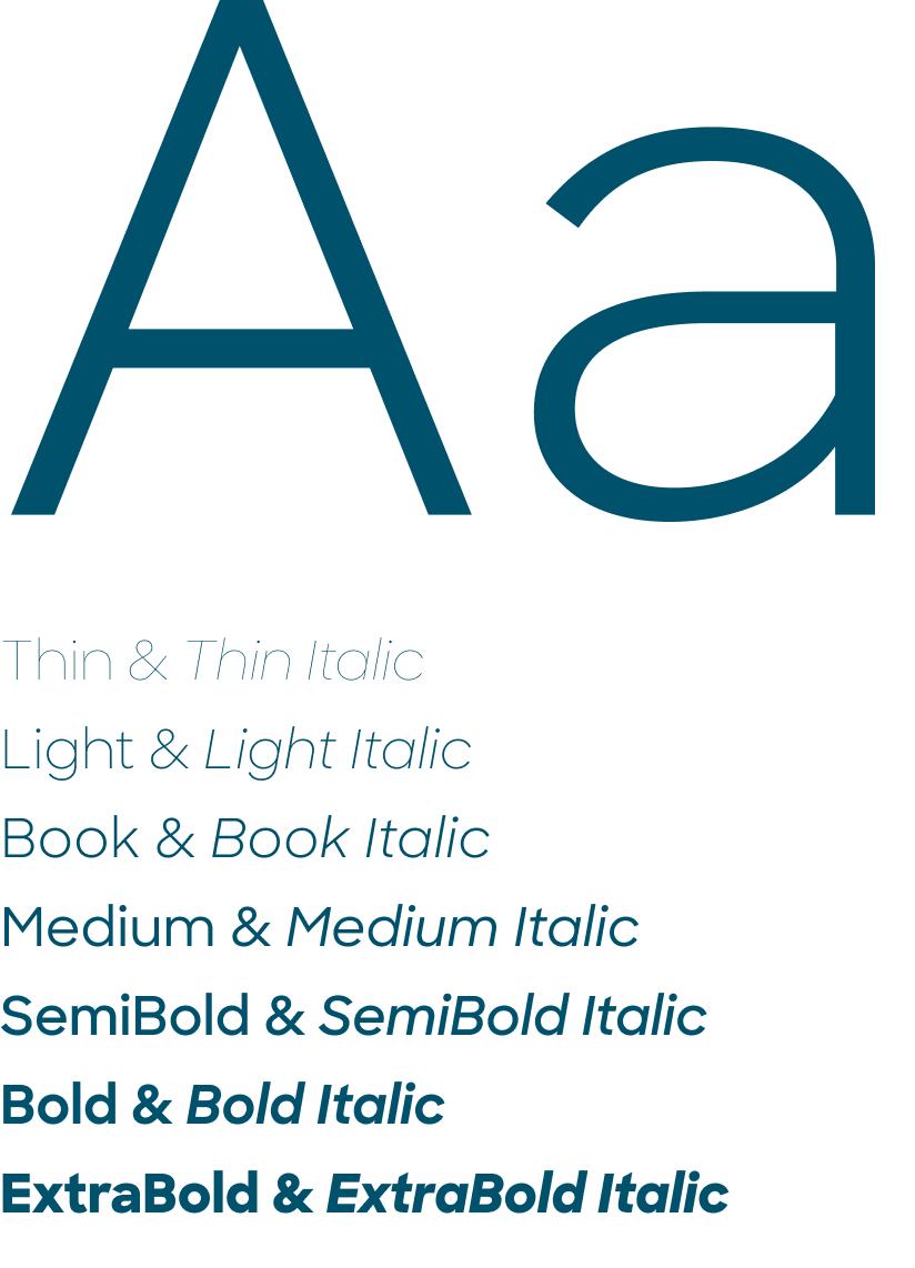
Glaston’s brand font is Sharp Sans. It should be used whenever technically possible and always in printed products, web applications and video presentations.

The font is available in the variants given here, and it can be obtained from Sharp Type.

Alternative typography

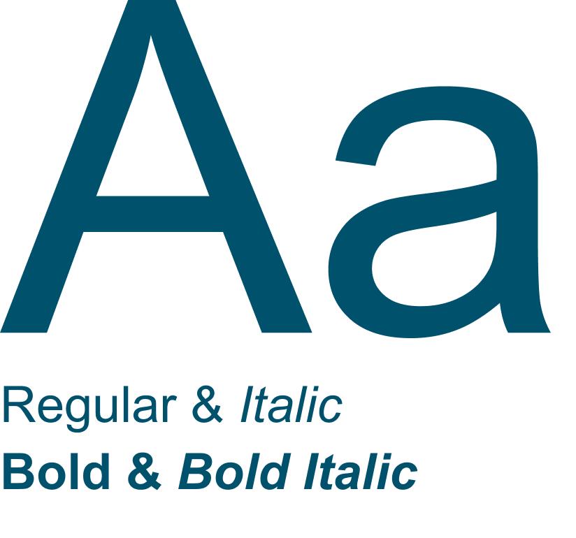
If the font Sharp Sans cannot be used, the font Arial should be used. Such use environments include Microsoft Office, among others.

Chinese typography

In Chinese language applications the font is Noto Sans CJK SC Light and Regular.

The font can be downloaded from Google Fonts.

Visual language

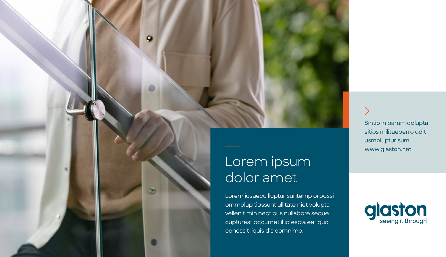
Glaston’s visual language and layout structure is based on horizontal and vertical areas, the windows as we call them. Windows form transformative entities that can consist of brand images, colour areas, and typography. Glaston’s Primary colour palette is used as a colour scheme in the layouts.

Powerful use of image areas combined with flexible use of color areas and typography is key to Glaston’s brand look & feel.

Imagery

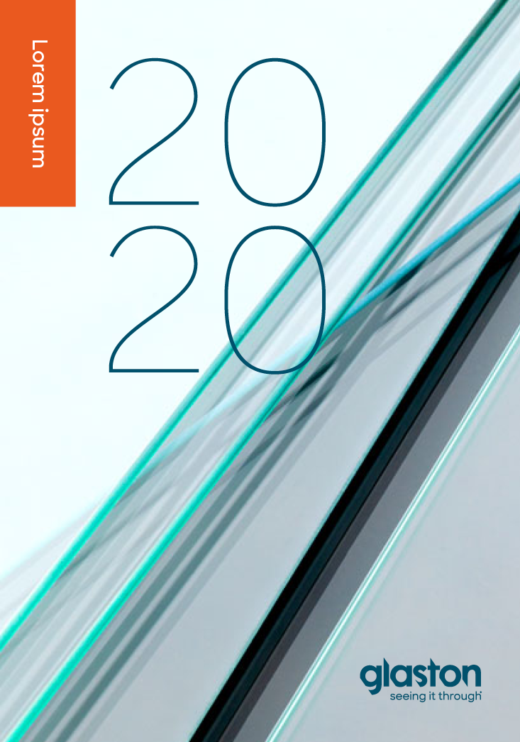
Glaston’s imagery offers perspectives on Glaston’s excellence: inside the company, out to end uses, and into the world of glass. Brand images can be divided into four categories: End uses, Glaston people, Glaston technology, and Glass.

> Available brand images can be downloaded from our Image gallery

End uses

Glaston people

Glaston technology

Glass

Icons

Glaston’s visual style of icons is simple and based on line graphics.